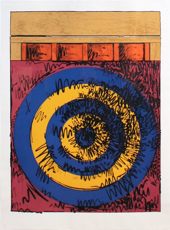
I took a long look at this picture. The one I saw is nothing like the one below, which I found online.
The work I saw was made with graphite, charcoal, pastel over screen on cream wove paper.
I saw from my Google search that there are many version of this subject.
In the work I saw, he has further hidden the meaning of the faces. Is he trying to make them ambiguous? The targets themselves are not the faces, and unlike the picture below, the work I saw only printed out the word FACE, but it's backwards. The four backward printed words say face: e c a f.
The screen has newspaper lettering but once we are in the target, there is only similar sized dots that remind us of letters. Have letters blurred into dots? Meaning into monotone Morse code?
The pastel give coloration and define vertical movement.
I think the stick of charcoal, on its side was gently scraped across the paper, and the natural bumps of the paper captured black dots in the same size as the printed font.
The circles of the target is only given in outline. A strong line defines the outer ring, while dashes -- the inner ones. But really the only thing that gives the "circle" identity is the highlighting scribble. Graphite scribbles provide volume and define the circles of the target. Indeed, if you look at the work from a sharp angle, the light will reflect off the graphite and give an uber highlight!
The color palette is much more muted than the picture shown below. In the work I saw, everything is darker, older, more the tone of old people's clothing, dirtied with living.
#object.//

No comments:
Post a Comment