Sunday, November 1, 2015

Landscape 1 - 10

#note.//

There are 10 pieces/works. All are the same size. They reminds me of the Google Street pictures at Artistic Google. Probably because both ARE representative landscape and there's only so many ways you can abstract and deconstruct the composition.


 #object.//

Untitled (1967)

#note.//

It's a very small piece. Probably Gerhard was just messing around.

It's solvent on printed paper, probably a newspaper. The solvent dissolves the ink from the newspaper and he transforms it into two movement blocks. The top block is vertical streaks while bottom is
horizontal

#object.//
N/A

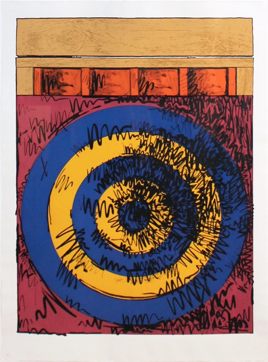
Target with Four Faces (1968)

#note.//
I took a long look at this picture. The one I saw is nothing like the one below, which I found online.

The work I saw was made with graphite, charcoal, pastel over screen on cream wove paper.

I saw from my Google search that there are many version of this subject.

In the work I saw, he has further hidden the meaning of the faces. Is he trying to make them ambiguous? The targets themselves are not the faces, and unlike the picture below, the work I saw only printed out the word FACE, but it's backwards. The four backward printed words say face: e c a f.

The screen has newspaper lettering but once we are in the target, there is only similar sized dots that remind us of letters. Have letters blurred into dots? Meaning into monotone Morse code?

The pastel give coloration and define vertical movement.

I think the stick of charcoal, on its side was gently scraped across the paper, and the natural bumps of the paper captured black dots in the same size as the printed font.

The circles of the target is only given in outline. A strong line defines the outer ring, while dashes -- the inner ones. But really the only thing that gives the "circle" identity is the highlighting scribble. Graphite scribbles provide volume and define the circles of the target. Indeed, if you look at the work from a sharp angle, the light will reflect off the graphite and give an uber highlight!

The color palette is much more muted than the picture shown below. In the work I saw, everything is darker, older, more the tone of old people's clothing, dirtied with living.


#object.//

Train Station (Hanover) 1967

#note.//
This is an offset photolithograph on off white wove paper.

Another offset work! The blur of the offset results in a ghostly image, hinting at a skull. Our ingrain brain wiring sees faces. You can't really see the skull and little ghost people in this Intersweb picture I found with Google. You have to go see the piece at the Harvard Museum! It's a small picture in real life.


#object.//

Pop Art Redefined (1971)

#note.//
I took a long look at this color screen print. It's one of Andy Warhol's classic Marilyn Monroe four color screen print on cartridge paper. I initial thought since it said "four color" screen that he used four colors. The four strong colors and the black "newspaper-like" print.

The closest picture I could find on the Intersweb is shown below, but it is nothing like the one I actually saw. Harvard has an "accident" offset print!

What I mean by this is that the blocks of each color do not sync perfectly with the black print. Unlike the picture below, the print a Harvard Museum shows blocks of pink and brown that don't line up exactly with the black print of Marilyn.

I initially thought there were four colors-- two pinks, a yellow, and a brown. These blocks of color obviously don't line up. The way the offsets occur suggests that this was done for a purpose. As with watercolor, the accidents delineate artist from amateur.

The brown hair is offset up relative to black, but the widows peak still matches. Strange, no? Or is it just me imagining things? (Don't look a the picture below. You have to go see this actual print)

The dark pink is the background. The hot pink are the lips and eyelid shadow, with the pink lips offset up from black reference. The eye-circle are in brown, unlike the picture below and are also offset up into the hot pink eyelid shadow to create a sleeping hot pink brown eye! Andy must have thought this funny.

The signature mole is also off set using the darker background pink.

There is probably four different pinks:
1. Background pink, which changes to a lighter shade
2. in a streak at the upper right.
3. Hot pink used for her lips and a collar of a nonexistent blouse? (the picture below has this)\
4. Finally the pink of the mole.

Oh. Hot pink is used for her ear rings!

You'll have to go and see a version of Marilyn and count the pinks! Enjoy.

#object.//


Albuquerque, New Mexico (1972)

#note.//

He was doing in 1972 what we are all doing now. Vertical lamp poles to segment, and half hidden living creatures. Everyone and their dystopic Mom are taking cityscape pictures like this, and even more complex ones in color.

#object.//

Indianapolis (1955-56)

#note.//
20151031.
I was at the Harvard Museum. It's free for me! I took a tour of the Pop Art exhibit. The main artist is Corita Kent but they put other works by contemporaries to show context.

Here's a Robert Frank's black/white photo called Indianapolis. It was dated 1955-56. This photo I found on the the Intersweb because I did NOT take a photo of a photo in the museum. That's usually a no, no, although I don't know why. The movement is perfect --from eyes to lips, while everything else suggest stasis.

#object.//